
 There are three things that will get you 80% of what you need to always create good presentations.
It’s mostly about taking things away.
Over the years I’ve done a lot of quick coaching sessions – one hour with one start-up company and one existing PowerPoint presentation. I specialize in high-tech business areas and I find myself homing in on exactly the same things every time. It’s the old 80/20 rule again. These three things will get you 80% of a good presentation. Or – I spend 80% of my time trying to get three things to work. Thought I’d share these on this rainy day in Sweden where I’m best off here in front of the computer.
One
The first one’s simple – just simplify everything. Haha. Simplify the concepts, the words/terms you use and your sentence structure, to the point when you as an expert start to feel positively uncomfortable with how easy everything seems. Assume that you will always, absolutely always, make it too complicated so you need to keep on simplifying. People who present complex subjects with simple language are judged as being more intelligent (than people who use complex language and specialized terms). ‘Nuff said.
Two
Put as little as possible on each slide (as a rule of thumb). Nothing at all is a serious option. I mean this is a good slide…
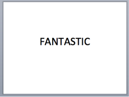
Now, why would I suggest something so daft for a slide? Well, that’s because this is exactly the lasting impression I want to leave the audience with. Whatever I just described when showing that slide was fantastic. The key word is Fantastic. I really want them to remember that. If you’re a mountaineer and you’ve climbed all the highest peaks in the world, the few slides you pick for a presentation will show the highlights (the peaks) not all the boring transport stretches in between. I guess. Reinforce the great stuff, the peaks, using your slides. That’s one way to think about it.
Hit that delete button!
Three
Take away text. Use pictures, preferably photos. The most serious problem is whole sentences. This overloads the grammar processing function in our brains, and people will probably never be reading the same bit as you are reading out loud. Text slides are really just the speaker’s manuscript – please stop showing us your manuscript! Break down the sentences to only key words. Then replace as many as possible with good quality relevant images. Yes, it’s hard work, so I’ll try to help a bit with a list of Internet sites that offer free, quality photos for commercial use. Fetch it here.
And then there’s that thing about three being a magic number. Three bullet points, and all that. So I have to stop here. Shame.
Have fun deleting all your hard-won slide contents 😉